
Recently, a number of my courageous subscribers allowed me to tear down their email sign-up forms.
Some of them were beginners, while others have been doing internet marketing as long as I have (9 years), if not longer. Most were in North America, but we also had an opt-in form in Dutch.
Despite these differences, the signup forms tended to make the same mistakes. And they're mistakes that are easy to correct.
As someone promoting products on the internet, your email list is one of your most valuable assets. So if your signup form isn't optimized for conversion, then you're leaving money on the table.
Are you making the most mistakes on your signup form? Read on and find out what these mistakes are and what you can do to correct them.
1. Weak headline
The main problem with most sign-up form headlines is that they're focused on either the incentive or the marketer. For example:
Sign Up for Our Newsletter!
Not very compelling, is it? And yet, the majority of websites use a similar headline on their signup forms. I confess, I used to do the same thing.
What's better? Focusing on your website visitor. Specifically, use the headline to answer this question, "What's in it for me?"
So even though you may be offering a newsletter, it's better to tell them what benefits they'll enjoy from your newsletter. For example, will it give them insider information? Up-to-the-minute news? Behind-the-scenes access?
You can also focus on the outcomes you're helping them achieve: Will your newsletter help them make more money? Save time? Write better? Have better relationships? Improve their health?
So your new headline could read:
Fast Veggie Recipes Even the Pickiest Eaters Love - Delivered to Your Inbox Every Week!
2. Vague offer description
Another common mistake I see in signup forms is the failure to explicitly say what you're giving away. Is it an ebook? A series of videos? A free 15-minute coaching session via Skype?
If you're vague about what exactly you're giving away, it will be hard for your website visitor to commit to it. So be as specific and concrete as you can.
Giving your incentive a name helps to make it more "solid" in the mind of your readers. So instead of offering just a weekly newsletter, why not call it "Camera Confidence Clips"?
The next tip addresses this mistake as well.
Are you making these mistakes on your email signup form?
3. No product image
Many opt-in forms don't use an image to represent the incentive. If you're giving away a book, whether it's in digital or phy?sical format, it's easy to put together a cover and use that as the product image. This way, even if you don't say what you're giving away, your readers can figure it out themselves.
Now, if your giveaway isn't quite as easy to represent visually, you should still create an image for it. It can be something as simple as an icon, such as this one:

Even an event can have some sort of visual logo. You can use a free tool, such as Canva, to create an image for your giveaway.
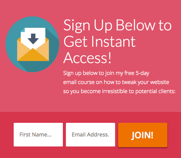
I also like to use Place.it to create mock-ups of my offer, making it even more desirable. Here's an example of a mock-up I created for a free email course:

BONUS: Grab your copy of the High-Converting Optin-form Checklist!
4. Ineffective button text
Another common mistake in opt-in forms is using the word, "Subscribe" in the subscription button. It's easy to see why most of us might use this word. Especially if you're offering a newsletter, then the person, indeed, is subscribing. And in fact, we refer to our email list members as "subscribers."
But research has shown that "subscribe" and "submit" aren't the best words to use on your button. The words "click here" and "go" performed best, according to research by Dan Zarella.
Copywriter Joanna Wiebe recommends avoiding "friction words."
"?Friction words are words that describe things people have to do – not things people want to do," she says. Here are the friction words to avoid:
- Buy
- Sign Up
- Submit
- Give
- Invest
- Donate / Sponsor / Support
- Complete
These words are sort of in the middle. You can use them, but Wiebe recommends doing some A/B testing to make sure they don't discourage your visitors from joining your email list:
- Join
- Share
- Switch
- Find
- Start
- Visit
- Learn
Now you don't get enough traffic to carry out A/B testing accurately, or just don't want to bother with testing, then stick to these low-friction words:
- Get
- Check Out (as in “check this out”, not “checkout”)
- Discover
- Reveal
- Earn
Create an image for your opt-in offer, even if it's an event. #emailmarketing
5. Unappealing button color
The next mistake marketers make with their signup buttons is using the wrong button color. There isn't one definite research into the best-converting button color, but red, orange, and yellow (the warm colors) seem to perform best.
Orange is a popular color for any button. In fact, that's the color of Amazon's "add to cart" buttons.
Before you run and change all your buttons to orange, yellow, or red, stop and think about how they will look in relation to the rest of your web page.
Warm colors convert better probably because they're vibrant and tend to pop out of the page. But if your page is already mostly pink, then you probably shouldn't make your button red.
Bottom line: Aim for contrast.
6. Using one-step forms
Finally, the most common mistake I saw was the use of one-step signup forms. In the past, this was the only type of opt-in form in all of the interwebs. You ask for the subscription and provide the signup fields for people to fill out all in one step, like this:
But with a two-step form, you get the subscription in two steps. First, you ask if the reader would like your incentive. And when they click on the button on that first form, only then do you show the submission form. Here's an example of a first-step form:

It's counter-intuitive but this multiple-step process in fact increases conversion rates. It first came into vogue after LeadPages announced that it saw a 60% lift in newsletter subscriptions when it switched to a two-step form.
That was five years ago. Today, almost every experienced marketer only ever uses two-step signup forms.
Was LeadPages' experience just a fluke, though? Or do other marketers experience the same boost in conversion when using two-step instead of one-step forms?
Hillsdale College sought the answer to this question twice, and both times, the two-step signup process significantly out-performed the one-step signup.
7. Poor overall form design
This mistake was less common, but in this day and age, it still happens. Here's what my opt-in form looked like when I was using Mailchimp's form builder:
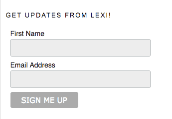
Can a signup form get any worse than this? The problem isn't just that the form has no color or design elements at all. And, really, Mailchimp doesn't let you change the button color or add images to the form, so could you blame me?
(But the copy on this opt-in form is just as terrible as the design, which is not Mailchimp's fault! In my defense, this was when I was on hiatus from online marketing and doing no email marketing of any kind at all.)
Thankfully, nowadays, there are so many easy ways to create better-looking email signup forms. So when I decided to do online marketing again, that ugly form became this:
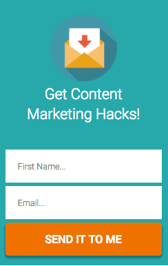
Much better, don't you agree? Against the white background of my website, the form practically jumps out of the screen. The headline is much more compelling ("hacks" vs "updates": which one has stronger appeal?), and the big orange button is just begging to be clicked. In other words, it's a form you can't ignore.
So pay attention to the overall design of your opt-in form. Take advantage of form builders that provide conversion-focused templates you can easily customize with your copy, images, and branding colors.
Learn from these Email Signup Form Mistakes
The bottom line is that you need to sell your opt-in incentive, even though you're giving it away. This means highlighting its biggest benefit to your readers. And you have to make sure that your form is visually appealing as well.
"You need to sell your opt-in offer even though you're giving it away." #emailmarketing
Just one caveat: even though I've made several suggestions for what makes forms convert better, the only way to know for sure is by A/B testing your forms. You can use a free tool, such as Goals in Google Analytics, to see if the changes increase your conversion rates.
But A/B testing is neither practical nor accurate when your website isn't getting a lot of traffic. For your results to be reliable, each form should be displayed at least hundreds of times (the more, the better). This means you need a minimum number of unique visitors to reliably test two versions of a form.
So if your website traffic is much less than this, it can take you forever to get reliable results. To me, that's simply a waste of time.
It would be much better for you to go with what works most of the time for people who do have the traffic and have done the testing.
And then when you do get enough traffic, then by all means do A/B testing to continually tweak and optimize your forms and web page (Recommended Resource: Always Be Testing: The Complete Guide to Google Website Optimizer).
You've gone this far, so tell me: Which of these mistakes are you making on your email signup forms?


