Are you looking for an alternative to LeadPages or OptinMonster?
I've used half a dozen lead generation apps—including Leadpages, OptinMonster, and Thrive Leads—so this article is informed by my first-hand experience.
When I first heard about LeadPages, my internet marketing friends were raving about the beautiful, conversion-optimized landing pages. LeadPages took the headache out of creating landing pages and opt-in forms with their customizable templates. To top it off, their templates are tested and proven to convert.
LeadPages then became known for the two-step opt-in form. That is, you don't ask for the web visitor's contact information upfront. Instead, you make them click on something first, and then you display the form to submit their name and email address.
These forms convert better because the first click is a micro-commitment that compels the visitor to complete the subscription process.
Today, every digital marketer uses two-step opt-in forms.
Naturally, when I decided to revive my digital marketing efforts, I wanted two-step opt-in forms, too. And beautiful landing pages and forms. And other cool features, like being able to control where the forms show up and when.
FAIR WARNING: This post is long. Use the Navigation below to skip to the section you're interested in. (Alternatively, you may want to download the PDF version by clicking below:
The Problem with LeadPages
I considered LeadPages, but the investment was too much for me. Since I have a full-time job and a family to take care of, online marketing is something I do on the side. And it always takes a back seat when things get intense at work, or when family issues come up.
In short, I couldn't justify the cost of LeadPages.
The Problem with OptinMonster
I've been using OptinMonster since joining Mirasee in 2015, so you could say I'm already an intermediate-level user. It also has opt-in form templates and controls over where to display your forms. But it doesn't have two-step forms, except for the MonsterLink feature, where forms are triggered by clicking on a text link or an image. Not exactly the same thing. (Note: This may have changed since I last used OptinMonster.)
What's more, I've been really frustrated with OptinMonster, because the templates aren't as customizable as I'd like them to be. For example, I can't move where the image is. If I don't want a sub-header, I can delete the default text, but the space for the sub-header remains. And with some templates, when I change the text of bullet points, the bullets get all messed up.
So I went on a quest for an affordable alternative to LeadPages and OptinMonster that:
- provides opt-in form templates
- including two-step forms
- that are customizable
- with control over where and when to display the forms
- and is affordable to a part-time digital marketer like me.
After asking my smart online marketing friends and looking at vendor websites and video tutorials, I decided to go with Thrive Leads.
And I believe I made the right decision. Here's why (click on the images to enlarge them).
13 Reasons to Get Thrive Leads as an Alternative to LeadPages and OptinMonster: The Essentials
1. Numerous Forms and Beautiful Templates
Thrive Leads is a WordPress plugin, which you can access as part of Thrive Suite. It allows you to create the following types of opt-in forms:
- lightbox
- widget
- content footer
- sticky ribbon
- inline forms
- slide in
- content lock
- screen filler overlay
- scroll mat
- multiple choice forms
- and, yes, two-step opt-in forms 🙂
And for each type of form, Thrive Leads provides multiple templates that look slick and professional.
2. Multi-step Forms
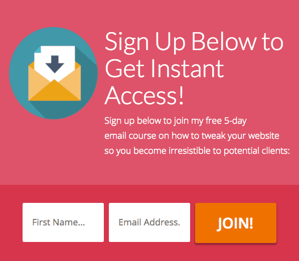
Thrive Leads offers true two-step forms. For example, at the end of this post, you'll see a form like this (you may or may not see it, depending on how you got to this post). This is step 1 (click to enlarge the images):

When you click on the big orange button, you'll see step two:

3. Extreme Customizability
Ok, I'm not sure if "customizability" is a word, but that's what Thrive Leads forms have. I can change colors, fonts, and spacing.
I can replace the image or get rid of it altogether.
I can add or remove text boxes.
I can even add social share buttons on my forms (WHAT?! I know, right? More on that later).
4. Affordable Price
I was looking for an opt-in builder that I could buy a la carte, without paying a monthly fee. But after experiencing the level of customer support and seeing the continuous development Thrive Themes does on its products, it was clear that the subscription was a good investment.
Thrive Leads is available as a standalone plugin for WordPress sites.
LEADPAGES
Standard
For Home Businesses
and Solopreneurs
$37/mo
OPTIN
MONSTER
Plus
"An entry tool for those just starting out."
$19 / month
THRIVE LEADS
Standalone WP plugin
Install Thrive Leads on existing WordPress websites
$16/58 $6.58/month (billed annually)
With prices like that and the robust features (detailed below), clearly, Thrive Leads is a better deal than either LeadPages or OptinMonster.
Eventually, I decided to get the entire Thrive Suite, which has a monthly subscription fee of either $49.91/month (paid annually) or $49.67/month (paid quarterly). This gives me access to ALL Thrive products, including their theme builder and WordPress plugins for content building, collecting and displaying testimonials, creating quizzes, and more for all the websites I own.
5. Display Targeting
I wanted to be able to display different opt-in forms for different blog post categories. I can do that with Thrive Leads.
But I can also have different forms for different pages and even for specific posts. And Thrive Leads goes even further. You can save your settings into display templates, so you don't have to keep repeating which pages and posts to include or exclude, every time you create a new form.
This is a big help, especially when you have plenty of "transactional" pages, like thank-you pages for each of your lead magnets. Naturally, you wouldn't want your popup forms, for example, to show up on those thank you pages, as well as on sales pages and opt-in pages.
At this point, I've already checked off all my requirements by going with Thrive Leads. But the more I use the plugin, the more convinced I am that I really made the right choice.
Looking for an alternative to LeadPages and OptinMonster?
Thrive Leads has so much more going for it, such as:
6. Thrive Boxes
If you offer content upgrades on your blog posts, then you'll use Thrive Boxes to create opt-in forms that display whenever your reader clicks on a text link or image. This is comparable to LeadPages' LeadBoxes and OptinMonster's MonsterLink.
To show you what I mean, CLICK HERE.
I've read another blogger refer to this feature of OptinMonster as being a two-step opt-in. In a way, it is, because the reader has to click on either a link or an image for the form to pop up. But, as you've seen in my example above under #2, OptinMonster's MonsterLink is not a true two-step form.
Seriously Awesome Stuff
7. Asset Delivery
This is a feature I didn't know I wanted until I learned about it.
Here's how it works: Thrive Leads integrates with your email service provider (such as Mailchimp, AWeber Email Marketing, etc.) and email platforms (like Amazon SES, Mandrill, and Postmark) to automatically send new subscribers the download link to the ebook or other digital material they signed up for.
Normally, you would have to create a new autoresponder email and download page for every lead magnet you have. This becomes very tedious when you have many lead magnets, especially if you offer content upgrades in your posts. Thrive Leads' Asset Delivery feature simplifies this process.
You create a template for your fulfillment email using short codes. And then when you create a form for a new lead magnet, you only have to specify the link to the PDF (or even a download page), and Thrive Leads will take care of sending the download email to your new subscriber.
I'm having a hard time explaining, so the best way is simply to show you how it works:
8. Multiple States
This is one of my favorite features of Thrive Leads!
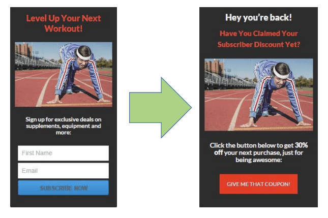
Aside from creating multi-step forms (a step being a "state"), this feature lets you give your website visitors a better experience. For example, you can create an "already subscribed" state so that, instead of seeing your opt-in form, people who are already on your email list will see a different offer instead. Like this (click image to enlarge):

You can also use form states to create a "thank you" state. That is a version of the form that a person sees after hitting the subscribe button. You can put a link to download your lead offer in this state, although I prefer to send that by email. That way, my subscribers get used to opening my emails and clicking on the links in them.
What I do instead is encourage my new subscriber to share my opt-in page in social media (click image to enlarge):

I prefer using this thank you state instead of sending people to a thank you page after they subscribe. I think the experience is much smoother, since the reader stays on the same page/post where they subscribed. And if the popup form had interrupted them while reading the page, they can continue reading after filling out the form.
9. SmartLinks
SmartLinks work with form states so that your website can "recognize" who has subscribed and who hasn't. Thrive Leads generates a SmartLink to any page you specify and that's the link you use when you email your subscribers. When they click on the link in your email, your website displays the "already subscribed" state to them.
10. Signup Segue
This is another feature that gives your subscribers a good experience. It lets them sign up for things like webinars or even another lead offer with just one click. Think about it: They're already on your email list. Why would you make them fill out a sign-up form again?
This is how I feel about Signup Segue:
11. Mobile Responsive Forms
I have a confession to make: I sometimes check my site on my iPhone just to see how good it looks! I've noticed that other sites with popups behave terribly on smartphones. The forms are too big for the screen, can't be closed, or look simply messed up.
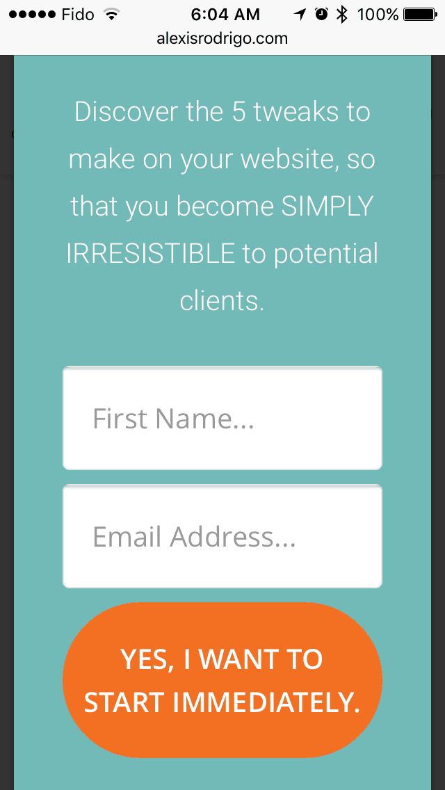
With Thrive Leads, I know my forms always look good on mobile devices. Thrive Leads even has a Smart Exit option for exit-intent popups so that, on mobile devices, they appear after a specified number of seconds instead. After all, mobile devices don't know when a reader is about to exit, do they? (Click image to enlarge)

Nice Extras
12. Mouseover Animation
We all know that motion attracts attention, and now, you can animate elements of your opt-in form. Imagine your ebook cover (or other image) moving when your reader mouses over it. Actually, don't imagine. Here's a demo:
It's no big deal, but it does set your opt-in form apart from others.
13. Opt-in Form Countdown Timer
This is a terrific feature to have when you're promoting a time-sensitive lead offer, such as a live webinar. The timer can be to a specific date and time or for a specified duration in days, hours, and minutes (click image to enlarge):

Lightyears Beyond Collecting Emails
As you've seen, Thrive Leads is all about converting your website visitors into email subscribers.
But for me, the benefits of using Thrive Leads go beyond that.
It gives my website visitors and subscribers a good experience, so that they feel respected and valued. They see offers that are relevant to them. And they don't have to sign up over and over again for my stuff.
These are all things we strive to do on the Mirasee website as well. As some of you may know, Mirasee is a multi-million-dollar company made up of about 20 employees, including a small IT team. And we paid another company a lot of money to set up the Mirasee site so that it does what I can accomplish with Thrive themes and plugins.
That's right. I'm able to do give my audience a customized experience all by myself on this little website, thanks to Thrive Suite products.
This is why I believe Thrive Leads is the better alternative to LeadPages and OptinMonster.
"An opt-in builder should go beyond collecting emails to letting the audience feel respected and valued." @ThriveThemes
One-time Purchase vs Recurring
Why do I keep using Thrive Suite when I wanted to pay a one-time fee in the beginning?
A friend of mine made a good point about this. She had been using a different opt-in form creator that she paid for with a one-time fee. It's quite a popular app, but the developers decided to stop supporting it. In exasperation, she said, "I'm willing to pay recurring fees if it means the developers will keep supporting the software."
She made me realize the value in sustaining the developers so they can keep sustaining us, the users. And that's why I happily keep paying for Thrive Suite.
This website uses Thrive's Pressive theme. I put together this blog post, my home page, testimonials page, and about page using Thrive Architect. And I use Thrive Ovation to collect and display testimonials. It's also my contact form. I'm like a poster girl for Thrive Suite 🙂
By making Thrive Suite the foundation and backbone of my WordPress website, I know that all the tools work together well. And I'm able to make the most of the features, because they're inter-connected.
What about you? Which features of Thrive Leads are most attractive to you? What are you using now for your opt-in forms?
CURIOUS ABOUT THRIVE LEADS?
"WOW, a 238% increase in conversions when I switched to Thrive Leads. This is the most powerful list building plugin I’ve used and the team behind it is ON FIRE!" John Lee Dumas, Entrepreneur on Fire
Affiliate Disclaimer: I am an affiliate of Thrive Themes. That means I'll earn a commission if you purchase any of their products through one of my links on this website. While I only ever recommend products/services I myself use and believe in, you should always do your due diligence before purchasing any product.


